I started NRW Charging Atlas as a spare-time project in June. It’s now on GitHub. You can use it to compare charging coverage for electric vehicles (EV) across North Rhine-Westphalia (NRW), Germany, then propose new stations and see how the district scores change.
I wanted to understand where charging provision looks thin and which districts deserve a closer look. I also wanted to be able to question the results. If a district ranks highly, you should be able to see what put it there and decide whether those assumptions make sense.
This was a chance to put GeoNode and PostGIS to work in a complete application, from importing public data to exploring it in a browser. Here I’ll explain the choices behind the scores and the data pipeline. To run your own copy, follow the visual walkthrough, or download the eight-slide presentation (PDF) for a quick overview.
What a district ranking can tell you
The atlas covers all 53 NRW districts. It combines the official public charging register with population, traffic, mapped grid infrastructure and energy data.
You can start with a question about charging coverage, switch to investment priority, or compare EV readiness. The rankings change because each view asks something different. For investment priority, for example, transport and infrastructure context also contribute to the score.
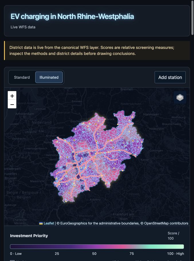
The dashboard brings the district comparisons together. Each ranking uses a different indicator; the selected district’s panel shows the measurements behind it.
I kept the analysis at district level. It gives you a starting point for investigating charging locations. Choosing an actual site needs more local information, especially about the grid: a substation on the map doesn’t tell you how much spare connection capacity it has.
How I put the scores together
Take EV Readiness as an example. I combine three components:
- Charging points per km², with a 40% weight.
- Accessibility to the nearest station, with a 30% weight.
- Charging points per 100,000 people, with a 30% weight.
For accessibility, I use the straight-line distance from the district’s centroid to its nearest station. Shorter distances get a higher score. It’s a rough district-level measure, so you can see that definition alongside the result.
These measurements use different units, so I decided to normalize at p5 and p95 using the official baseline across the districts. Those percentiles set the lower and upper bounds: I clip values outside them and scale the result to 0-100. When a higher measurement means worse coverage, I flip the score. That way, a higher component score always points in the same direction.
If a required measurement is missing, I leave the affected score unknown. Redistributing its weight would change the meaning of the score. I also calculate the total from the same rounded components you see on screen, so you can check the maths yourself.
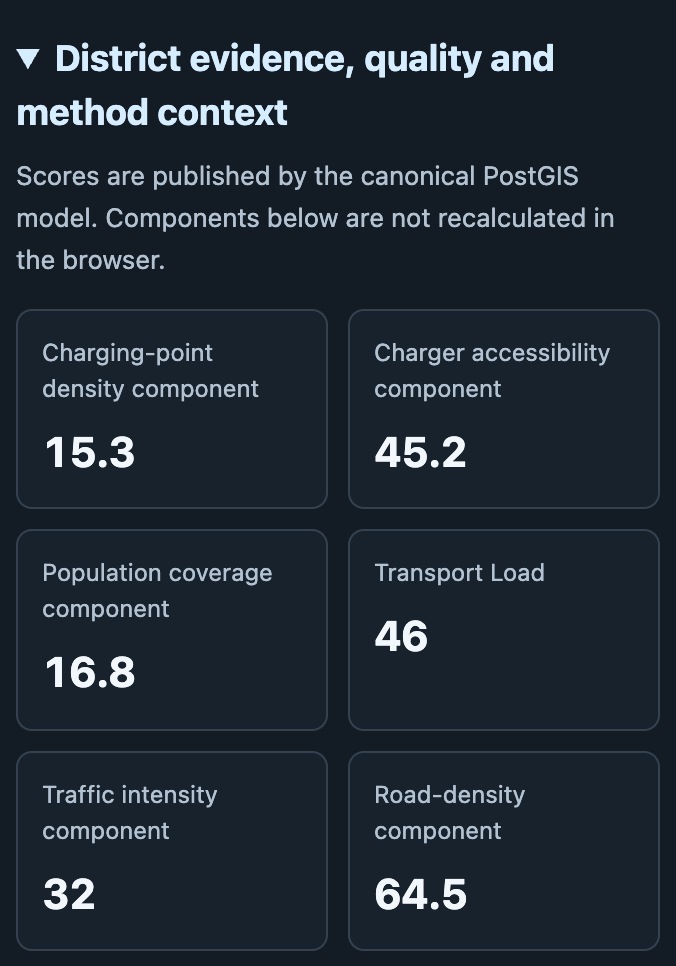
Charging and transport components for Recklinghausen, cropped from the evidence panel. Its readiness components are 15.3, 45.2 and 16.8. Apply the 40/30/30 weights and you get the displayed readiness score of 24.7. These values come from PostGIS, so inspecting the panel and checking the database should give you the same answer.
The scoring model lives in the database, including its weights, units and baseline bounds. SQL checks recalculate the district totals from that model and compare them with the published results.
What a scenario changes
Proposed stations live separately from the official charging records. I send edits through GeoServer’s transaction interface and keep them in PostGIS, so proposals survive an app restart while the official records stay read-only. Each proposal records its charging-point count, total station power and maximum power per point. I keep those two power values separate because they answer different questions about what a station can supply.
Adding a station updates the district measures that depend on chargers. Population, traffic and the electrical network stay as they were. You can use this to explore how the scoring model responds to a proposal; predicting demand or checking whether the grid can serve it would need more data.
I keep the official baseline’s normalization bounds fixed when you add proposed stations. Your scenario can improve a district’s result without changing the benchmark you’re comparing it against.
Why I kept the calculations in PostGIS
I gave PostGIS responsibility for the spatial calculations and scoring. The map, ranking and district details all read the same results, and I only have one set of formulas to maintain. The Leaflet and TypeScript frontend handles the interaction.
Python validates the public inputs and loads them into PostGIS. GeoServer publishes the results as map and feature services for the dashboard. GeoNode manages the dataset catalogue, metadata and publication permissions. Its job here is to make those published layers discoverable and keep their source information close to the data.
Inside PostGIS, I separate raw inputs, staging, analytics, publication and scenarios. I store expensive spatial measurements in materialized views, then use live views to normalize and combine them. Data refreshes follow the same path through those layers.
I also use different coordinate systems for different jobs: EPSG:4326 for web interchange and EPSG:25832 when calculating areas, lengths and distances. The architecture guide has more detail on the database model and how the services fit together.
Keeping track of the public data
Downloading several datasets on the same day doesn’t mean they describe the same period. I wanted to keep that visible when comparing districts.
The atlas uses Eurostat boundaries and population, the Bundesnetzagentur charging register, Straßen.NRW traffic data, Energieatlas NRW and the Geofabrik OpenStreetMap extract. Open Power System Data adds context about conventional generation, but it doesn’t feed into the scores.
GeoNode keeps the source information with each published layer. I build its metadata from the data that was successfully imported and exported, so it refers to what’s actually behind the map. The runtime manifests also record source dates, file hashes, feature counts and the formula version.
One detail you might notice: the renewable overlay shows operating wind and ground-mounted solar installations, while the district totals use a broader inventory. The visible map layer and the analytical dataset serve different purposes. Changing what you see on the map doesn’t change the data behind a score.
You can find the full list of inputs in the source guide, with their terms in the attribution notice.
Keeping the local workflow reliable
I included a Dockerfile and Compose configuration for the full app. The bootstrap command builds the stack, imports and checks the data, exports snapshots and publishes the layers. That gives the setup a repeatable path from public inputs to the dashboard.
I also wanted the app to remain useful if a live data service went down. It can fall back to saved PostGIS exports and clearly labels when it’s showing a snapshot. Scenario editing is disabled if its live services are unavailable, so you won’t think you’ve saved a proposal when the connection has failed.
The repo includes checks for the Python loaders, frontend and PostGIS integration, including scenario persistence and data refreshes. You can also test a backup with the restore drill. It restores the saved state into a separate Compose project and checks the database and scenarios there, leaving your running stack’s volumes alone.
The setup guide covers refreshes and recovery, and the test guide explains the checks you can run.
Where I’d take it from here
This version covers the local workflow I set out to build: compare districts, look into the scores and try proposed stations. If I took it further, a shared service would need separate scenarios for different people and a deployment plan. Getting closer to site selection would mean adding local constraints and measured grid-capacity data. Forecasting future demand would need its own model and validation.
If you’d like to test the model against a district you know, the visual walkthrough covers startup, your first proposal and the published datasets. The source is on GitHub.